Read a drinks menu as a piece of design
A menu begins making decisions for you before you order. Its sequence, spacing and descriptions suggest what deserves attention. Reading that design is useful even when the most appealing drink is alcohol-free.
This guide turns that first impression into a small, repeatable exercise: identify what the page tells you, compare two entries and write down the question the menu leaves unanswered. The examples below are invented for the exercise. They are not reviews, prices or serving information from a real café.
How is the menu organising my choices?
First, look at the section headings without reading the descriptions. A menu might group drinks by base ingredient, flavour, season, serving style or house invention. Those approaches answer different questions. “Citrus” helps a reader who knows the flavour they want; “By the glass” helps someone deciding on a format. Neither heading, on its own, tells you everything about the drink.
Now trace one route through the page. If you wanted a drink without alcohol, where would you start? If you wanted something small rather than a long drink, where would you look? Note the places where the printed information supports your choice and the places where you have to guess. An attractive heading can still be a poor signpost for a particular reader.
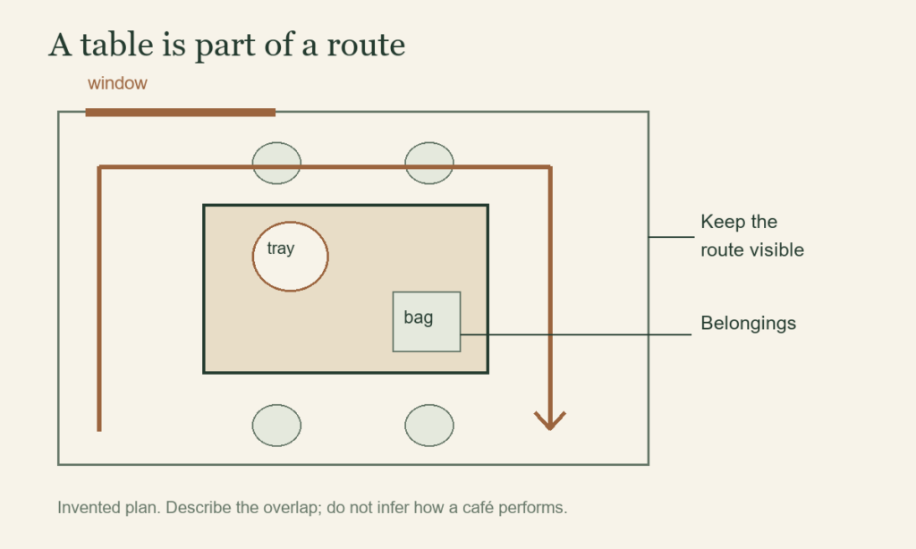
In your notebook, describe the organising principle before judging it: “Three flavour groups, each followed by a price” is an observation. “Easy for everyone to use” is a much larger claim that a single reading cannot establish. The distinction also matters when observing the room around a café table.
Which details make two entries comparable?
Imagine finding these two entries on different pages:
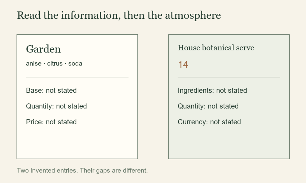
Garden — anise, citrus, soda
House botanical serve — 14
The first gives you a flavour outline but leaves the base, serving quantity and price unclear. The second provides a number without identifying its currency, the drink or what the serving includes. The wording supplies different kinds of information, so the two lines cannot yet support a fair comparison.
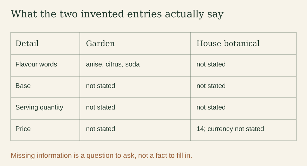
A useful comparison sheet has four columns: the named drink or base, the main ingredients or flavours, the quantity and serving format, and the price with its currency. Copy only what the menu says. If one entry is a glass and another is a bottle, mark that difference before comparing the numbers. If a modifier or supplement changes the price, keep it beside the entry it belongs to.
This is a way to spot missing information, not a demand that every menu use one layout. A short café board and a detailed drinks list have different amounts of space. A good question can be more useful than a longer description.
What can I infer, and what should I ask?
Start with the nouns. “A luminous journey through the forest” sets a mood. Named ingredients give you something more specific to ask about. Neither wording proves a serving size, alcohol content or price unless those details are supplied separately.
- What the example states
- “Garden” is described with anise, citrus and soda.
- A possible interpretation
- The description may be intended to suggest a fresh, botanical flavour.
- What remains unknown
- The base, the quantity, the price and whether the drink contains alcohol.
Do not turn an appealing name, a green colour or a “botanical” heading into an ingredient list. If a particular ingredient or alcohol content matters to your choice, ask the server directly. A menu-reading exercise cannot resolve personal dietary or health needs.
Write one concrete question, such as “What is the base, and what quantity does this price cover?” Avoid asking the typography to answer something the text never states. The same discipline helps when separating an object description from a provenance claim.
How would I make the description clearer?
For this exercise only, suppose the café supplies the following fictional answers: Garden is a 200 ml alcohol-free anise-and-citrus soda priced at £6. The other option is a 125 ml house spirit-based serve, also with citrus, priced at £14. These are invented facts added to complete the example, not facts inferred from the original two lines.
A clearer pair of descriptions would be:
- Garden: alcohol-free anise and citrus soda · 200 ml · £6.
- House botanical serve: house spirit with citrus · 125 ml · £14. Ask for the named spirit if it matters to your choice.
The rewrite makes the quantities, currency and broad type of drink visible together. It still leaves a useful follow-up question about the named spirit. It also makes clear why comparing £6 with £14 alone would not settle which drink suits you: the entries describe different formats and ingredients. A price-per-volume calculation might answer a narrow arithmetic question, but it would not establish taste, suitability or value to a particular reader.
A five-line observation sheet
- Route: Which heading would I follow for my choice?
- Printed facts: Which ingredients, quantity and price are actually stated?
- Missing detail: What is the one question I need answered?
- Rewrite: Can I put the confirmed information together without inventing a claim?
- Limit: What does this single example leave unknown?
Keep the structure of the example in your notebook, rather than copying an entire menu. Record one clear description, one confusing omission and one useful navigation idea. The exercise can help with a café board, a bookshop display or a small website: make choices easier to understand and leave uncertainty visible. Our botanical notebook exercise applies the same habit to labels and illustrations.